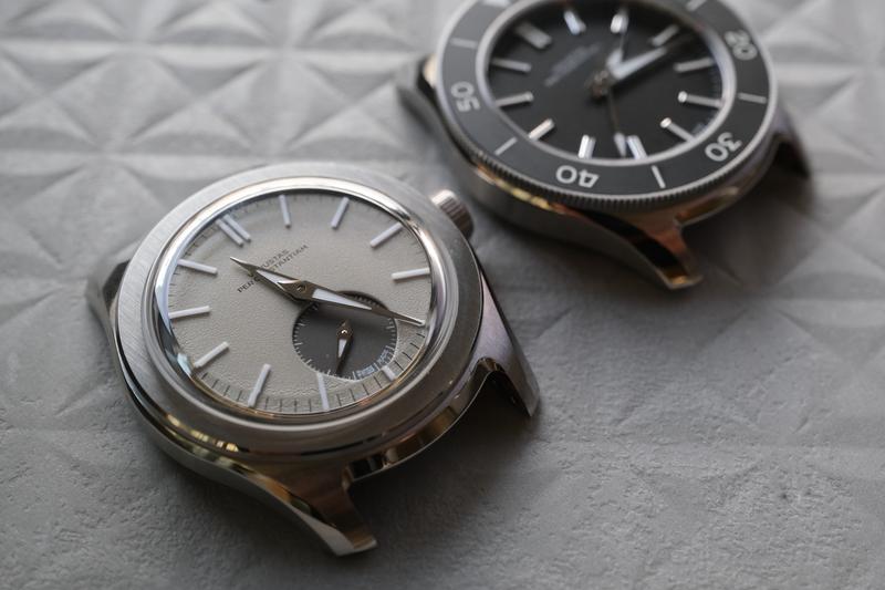
VPC has only made two watch models so far, and I was immediately sold on the first one. The
Type 39VM took a little more work. On paper, it’s an elegant black-dial dive watch. On the wrist, the VPC mantra of
“beauty through restraint” becomes a hard task to pull off.
When there are no fancy dials or complications, no oversized logos, the proportions and details have to do all the
work. The Type 39VM is a dive watch that is trying very hard not to shout – although it would deserve to. I
dissected every part of the watch for how well it holds up to the brand’s self-proclaimed
7 design principles.
Design Principle #1
Beauty through restraint
“Venustas Per Constantiam is Latin for ‘beauty through restraint’. What’s in a
name? Well, a lot, really. We create watches for modest, humble enthusiasts who prefer to enjoy their luxuries
privately. Our watches are made to slowly charm their way into your heart, not to impress across the room.”
I was a huge fan of the Type 37HW. But I have to be honest that it took
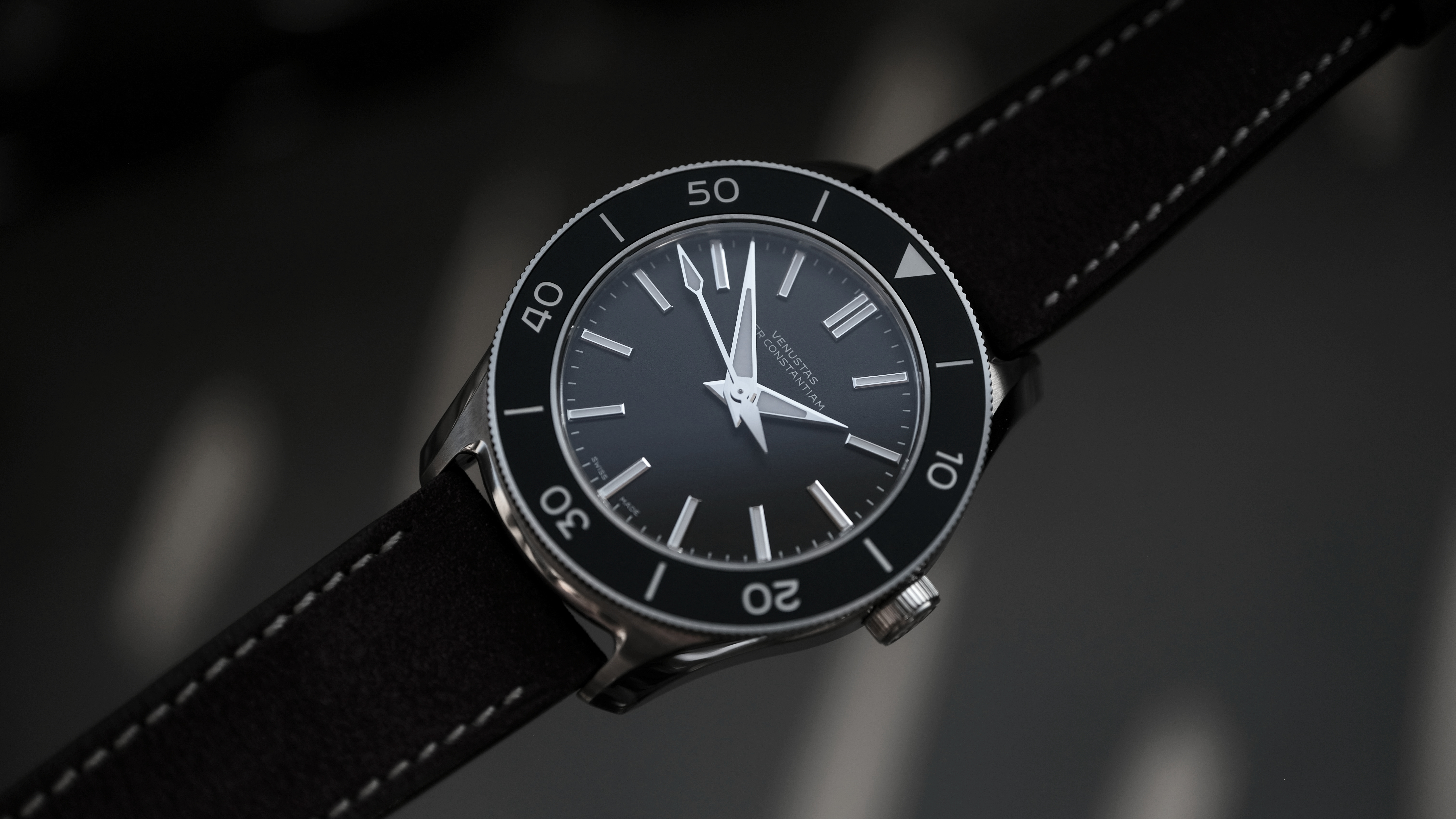
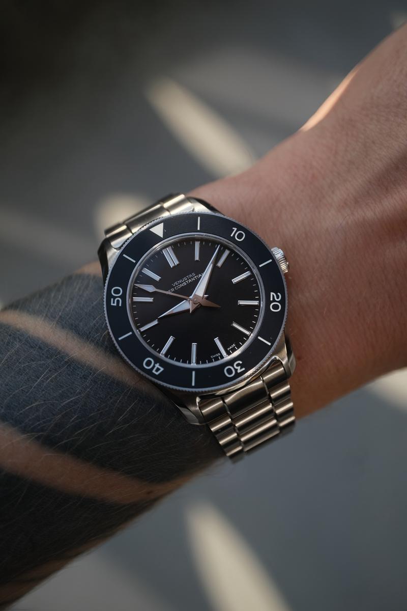
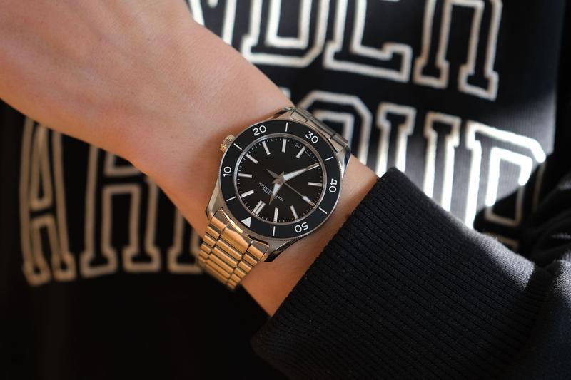
me a while to like the 39VM. At first it just seemed a bit dull to me. As always, you have to see the watch on your
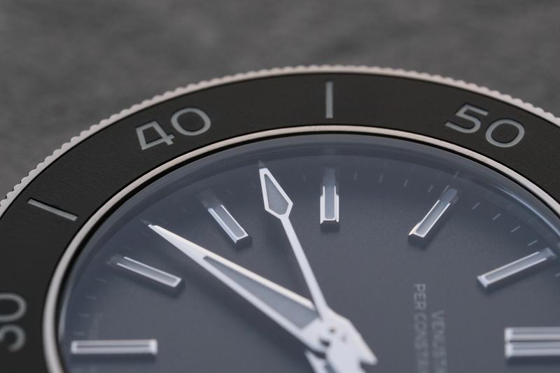
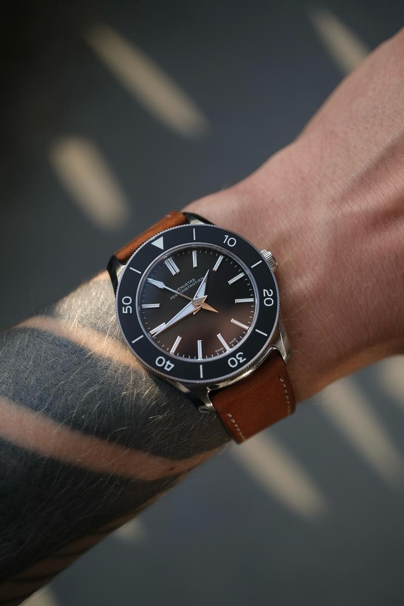
wrist. The proportions of the case, the quality of the build, the subtle structure of the dial, the bezel and the
top-grade case finishing are just so nice. So did it “charm its way into my heart?” I haven’t purchased it (yet),
but I have to say I keep thinking back to the watch. If I didn’t already have similar black dial watches, I would
have bought it.
Wrist circumference: 17.5 cm (6.89″)
Design Principle #2 Conceptual integrity
“Conceptual integrity drives every design choice. A watch needs to be comfortable, appealing, durable, serviceable,
and optimized for its intended purpose. The last thing we need is misplaced embellishment. A vignette sunburst dial
on a dive watch? Not at VPC!”
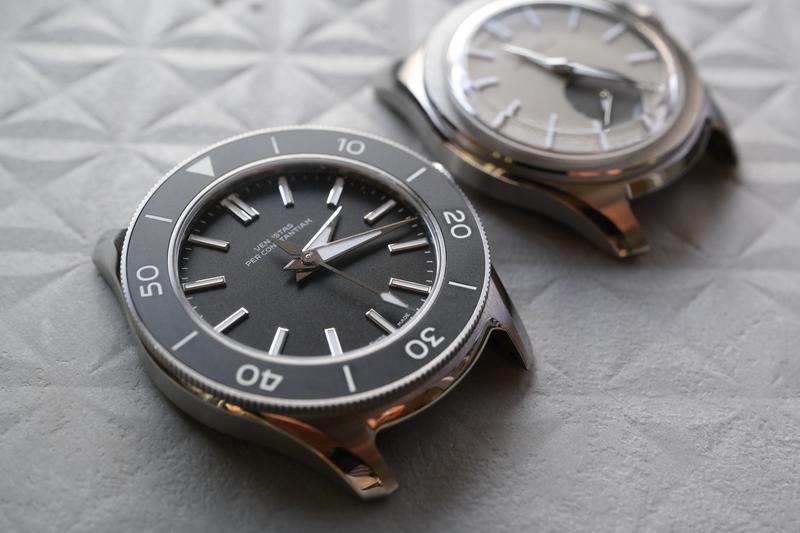
I think it paid off to have the same watch designer,
Max Resnick, lead the design of both
the 37HW and the 39VM. By “conceptual integrity”, I don’t just
understand that a watch is “optimized for its intended purpose”. I think of it that each model line has its own
distinct design, with subtle differences that add up. Many brands take the easy route: they start with a single
case, then expand it with complications. First a simple three-hand layout, then a GMT, maybe a date. Suddenly you
have 15 different dial variations and at some point they try to sell you a “rare Malachite” stone dial at a healthy
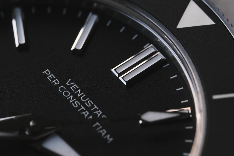
margin. VPC doesn’t do that. You can see the lineage in the Dauphine hands, the written-out brand name
Venustas Per Constantiam on the dial, and the blocky indices. There are subtly twisted lugs and a signature
“latch” that connects the case and bracelet, making it feel like one piece. The strap then looks integrated into the
case.
The 39VM offers two dial variants, one in Graphite (black) and the other in Frost (silvery white). The dials have a
very fine texture and aren’t just a plain color. The color is layered on, in varying levels of opacity, to create
depth. There is no Automatic print on the dial, no mention of the water resistance of
200 m = 656 ft. No boasting about being COSC-certified. Other brands might have plastered those attributes
on the dial. But you know it’s a good watch, why remind yourself of that? It feels great on your wrist and just
works, that should be enough.
The new Type 39VM.
VPC’s debut model, the Type
37HW.
Design Principle #3 Evolved mid-century
aesthetic
“We believe that watch design underwent a golden age in the middle of the 20th century. That doesn’t mean we cannot
improve upon it anymore today. We don’t want to sentimentally copy what our predecessors did, nor do we want to
throw away what was already great. Instead, we believe in an aesthetic that builds upon what was already great. We
call it evolved mid-century.”
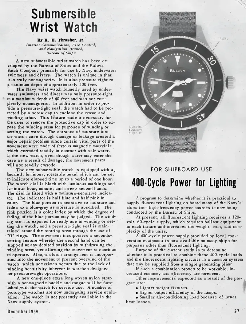
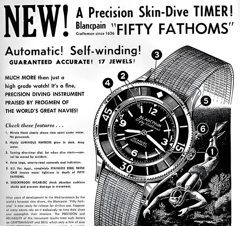
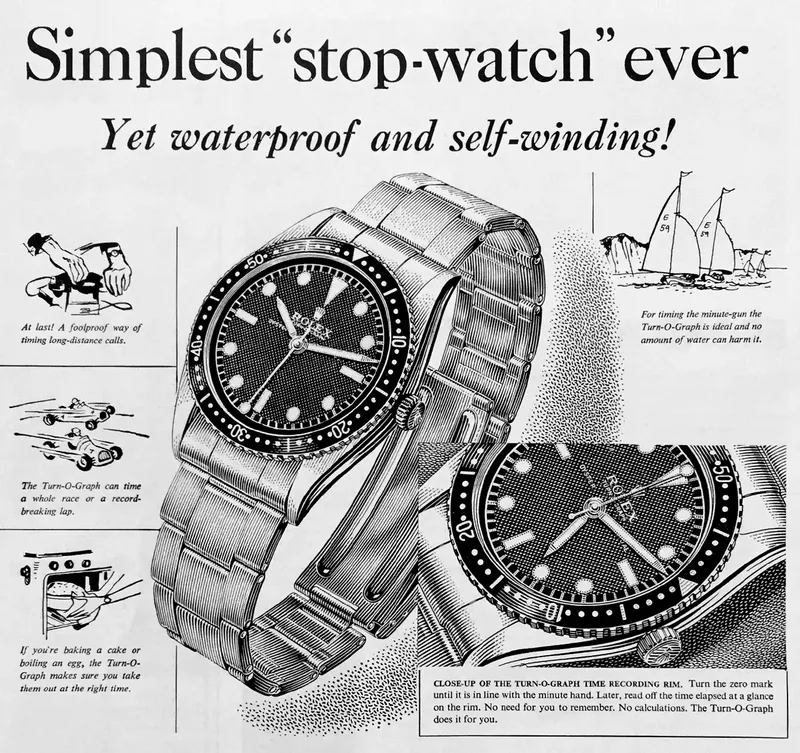
I don’t want to say the Type 39VM “looks just like a 1950s Bulova”. Many watches of different brands looked similar.
In the end, most of them shared the same supplier, be it for cases, hands, or dials. But as I dug through some
archives you can see the visual resemblance and what VPC means with the “golden age of the middle of the 20th
century”. Simple shapes, clear legibility, great grip and usability.
1959: Bulova ad for the “Submersible Wrist Watch”.
1953: Blancpain Fifty Fathoms (Reference 2462).
1954: Rolex ad for an Oyster Perpetual Turn-O-Graph.
Design Principle #4
GADA is the starting point
“Our watches, even those with a specialist purpose, are designed as
GADA (Go Anywhere, Do Anything) watches. We want you to be able to
wear them every day, whatever life throws at you. This means any VPC watch should be stylistically versatile and
mechanically rugged, whether it is a diver or a dress watch.”
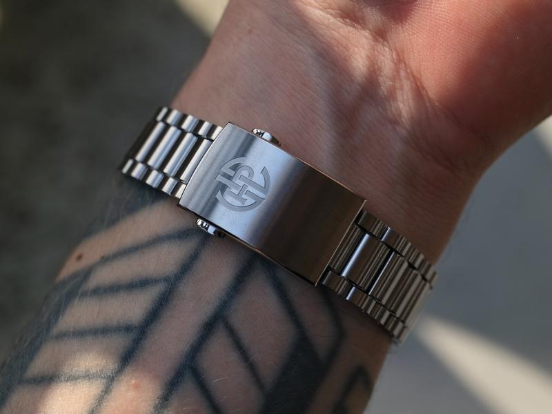
VPC watches have always had a quick-release system for the bracelet. While the 37HW only came on a steel bracelet,
the 39VM now includes an optional rubber strap. I find the new quick-release system easier on the fingernails. You
can just push it down. You don’t need too much force, but it never releases accidentally. A nice update. The
bracelet itself supposedly got an upgrade. It’s hard to see the differences, but I would say the links of the 39VM
feel a bit sturdier.
Left: the quick-release system of the Type
37HW. Right: the new system of the Type 39VM.
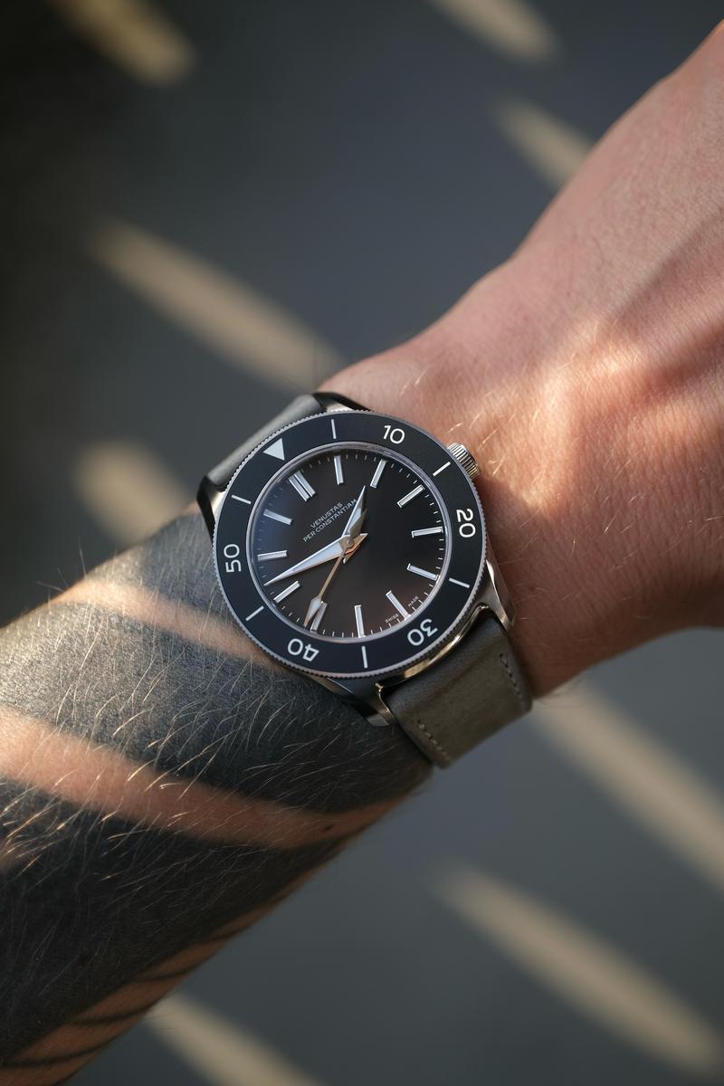
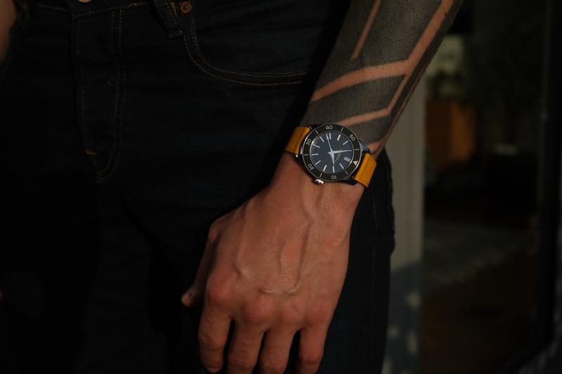
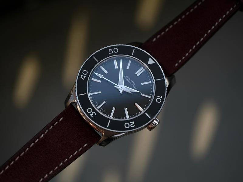
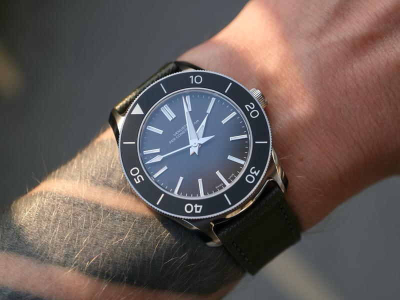
To me, GADA also means I can throw other straps on the watch and
anything works. The versatile 20 mm lug width helps here, since my drawers are full of straps for that size. So it’s
a watch that I can rediscover every day. I tested some combinations and quite like the result. Black dials are easy.
Cognac nubuck leather strap.
Concrete-colored
nubuck leather strap.
Yellow nubuck leather strap.
Burgundy nubuck leather strap.
Forest green saffiano leather
strap.
Design Principle #5
For the love of detail
“We love obsessing over the tiny details that make or break a watch. These are precisely the details that we feel
give VPC watches a right to exist. Think of our typography; always tailor-made for our watches, or the three-piece
endlinks tucked under an elegant ledge. It is such subtle refinements that give our watches their unique character.”
I really care about typography. I even felt the need to write
an article about watch typography. Since designing a watch is not
enough work already, founder Thomas van Straaten hired Samuel Baker to develop a custom font for VPC. Fun fact on
the side, I even hired him to design the monogram for Three-Quarter Plate. For the newly introduced rotating bezel
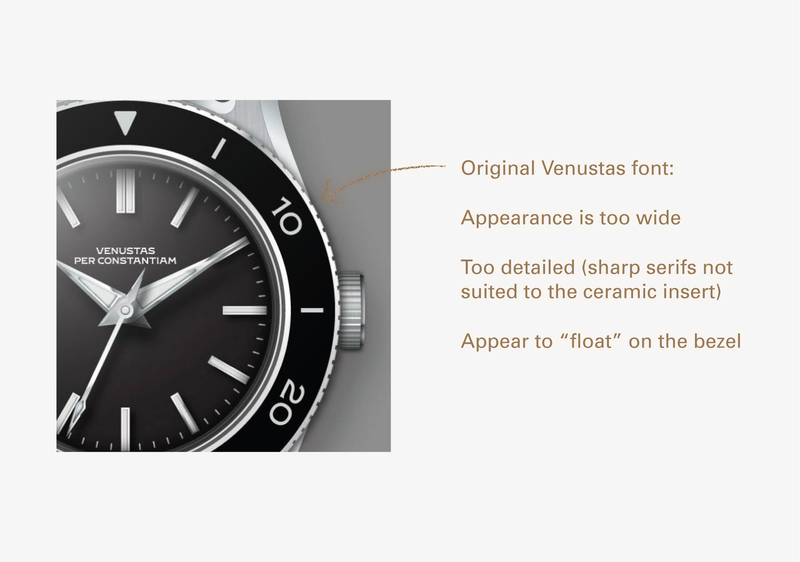
on the 39VM, you could’ve just taken the font and etched the numerals into the ceramic. But why etch a font with
serifs where the production technique requires a bolder typeface? Since the numerals would also be placed around a
circular plane, this called for an adapted font.
Source
Samuel Baker
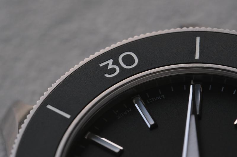
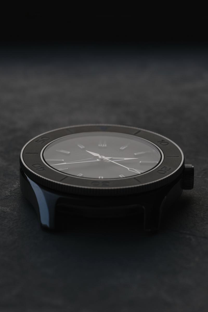
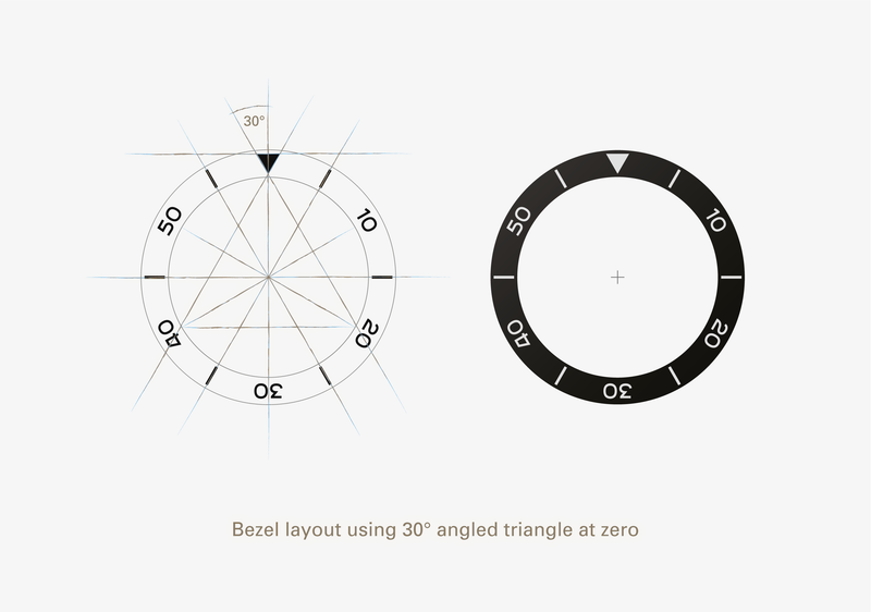
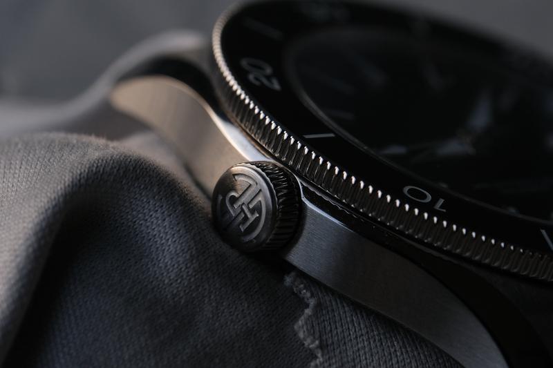
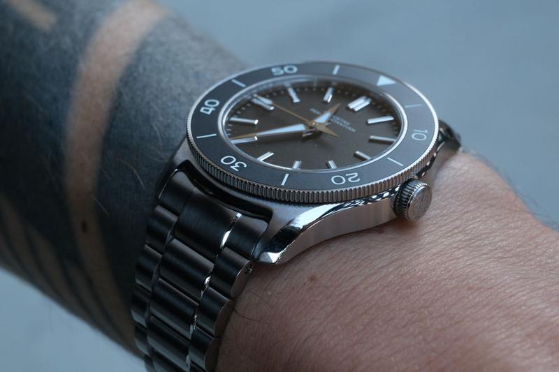
The bezel insert is made out of matte black ceramic, with the markings etched and filled with ceramic lume. This
results in a perfectly flush surface that doesn’t collect dirt.
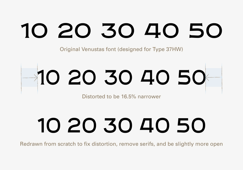
A new watch category, so we need a new font. The numerals were redrawn from scratch, the serifs removed and the
general shapes of the numerals were opened up.
Source
Samuel
Baker
Source
Samuel Baker
Putting it all together, it still looks like the same font, but if you look at the details you’ll see the
differences. Still the watch feels like it’s made from one piece and like it was always made that way. Not everybody
knows what makes great typography, but everybody feels it.
Source
Samuel Baker
Comparing the profile of the 37HW (left) and 39VM
(right).
Design Principle #6
Ergonomic design
“If you are to develop a lasting bond with your watch, it better feel great on your wrist. That’s why we spend an
inordinate amount of time on getting the ergonomics right. We make our watches as thin as possible, and curve them
to the contour of the wrist. We test the fit extensively through 3D printing before even entering the prototype
stage. The result is a watch that you forget you are even wearing.”
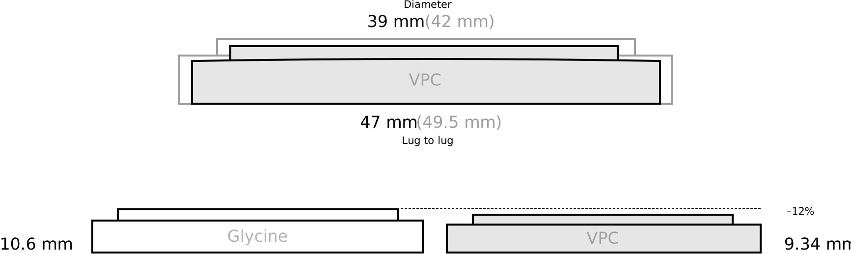
As thin as possible. I think VPC really nailed this one. The design brief was actually to build the thinnest 200
meter automatic diver on the market. The starting point is a top-grade,
COSC-certified Sellita SW300-1b. The movement is only
3.6 mm in height and serves as the foundation for this watch at only 9.34 mm thick. Other thin dive watches include
the Glycine Combat Sub (Reference GL0076) with an already impressive 10.6 mm, but here the VPC is another 12%
thinner.
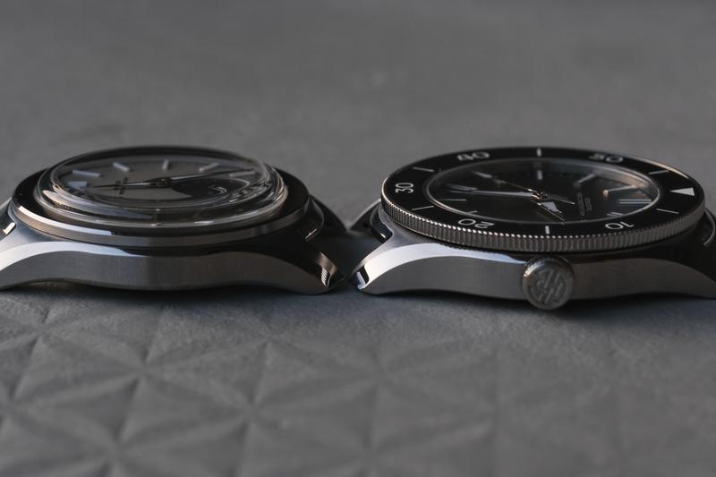
Comparing the profile
of the Glycine Combat Sub (Reference GL0076) (left) and Type 39VM (right).
Comparing the profile of the 37HW (left) and 39VM
(right).
Hodinkee posted an article about the Type 39VM and it asks whether anybody even needs a thin dive watch.
“It is very interesting to me that the pitch around this model is that it’s a record-setting dive watch […]
Perhaps it’s an easier-to-digest story than explaining all of the little details of tolerance improvements and
handstack modifications, but it definitely got me thinking. When it comes to dive watches, have I ever cared about
thickness?”Tantan Wang, editor at Hodinkee in
this article about the Type 39VM
If you only use a dive watch for diving, I agree that its thickness doesn’t really matter. But most people wear a
dive watch for how it looks. I find the bezel incredibly handy, not just for not dying underwater, but also for
tracking when my train leaves. It’s also useful for remembering when I need to be back after parking. I also wear a
dive watch when hiking in the mountains. In winter, it’s nice when my watch doesn’t stick out too much under my
jacket, but instead sits comfortably between my sleeve and glove. For that reason, I care about having a
thin dive watch, but only because I’d never go diving with it.
Wrist circumference: 14.5 cm (5.71″)
The 39VM on a smaller,
female wrist.
Wrist circumference: 17.5 cm (6.89″)
The way this watch tapers around the wrist is unparalleled.
Design Principle #7
Designed to endure
“All our products are intended to last, both physically and stylistically. That means we aim for durability,
serviceability, and a timeless aesthetic.”
I think the 39VM will definitely age well. All materials will age gracefully. It’s not riding any color palette
trends, which are trendy now. You get a black or a white dial. That’s it. All materials are of extremely high
quality and finished to the highest standard. The Sellita SW300-1b, finished to top grade and COSC-certified, will
endure for many years and run reliably. Spare parts are readily available.
Now, will you get a new bezel or pair of hands if you fall off your yacht and break the watch somehow? For the
moment, yes. In 10 years? Maybe. All you can go with is Thomas’ commitment to his company. I already quoted this in
my review of the 37HW, but I want to pull it up again.
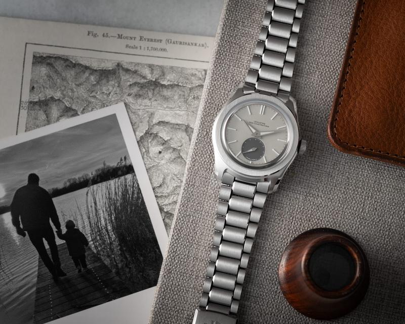
“I am building this watch company for the long haul. My products should last, and so should the company itself.
This is a deeply felt personal mission to build something my family can be proud of. I decided to symbolize this
in a photo by including a snapshot of me and my son. To me, VPC is bigger than myself, even if it is still a tiny,
fledgling watch company. The fact that you—the enthusiast community— enable me to build something beautiful fills
me with humility and gratitude. I will repay all the supporters with the best watches I can possibly
produce.”Thomas Van Straaten, founder of VPC
Source
vpcwatch.com
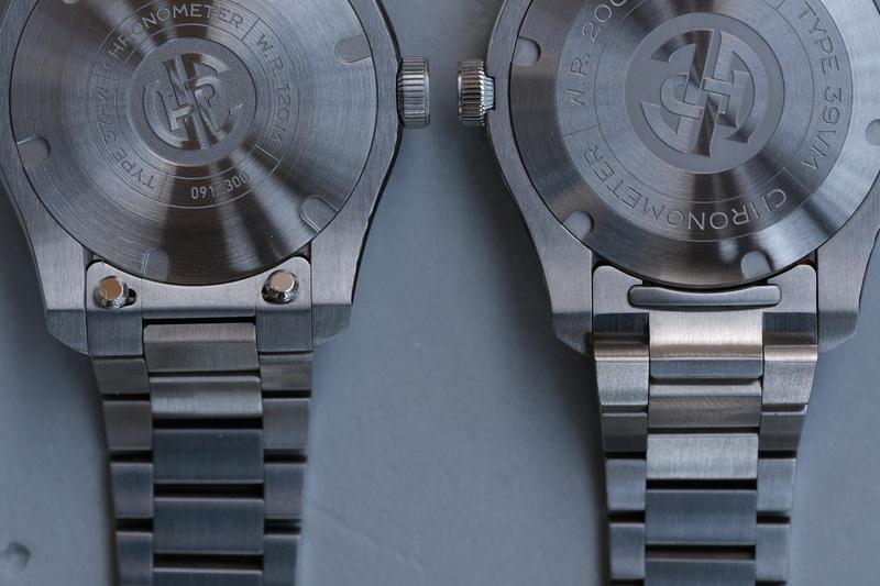
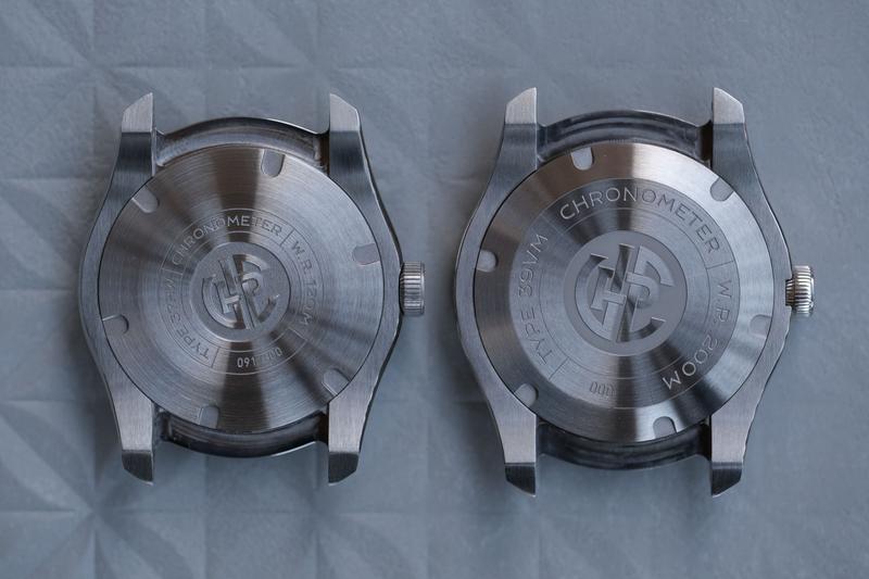
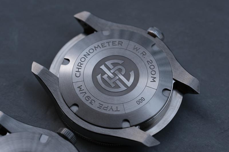
The engraving on the caseback is a little shallower than on the previous model. The previous Type 37HW was never
uncomfortable in a way that it leaves an “embossing” on your wrist after wearing it longer. I would also say that
the circular polishing is a bit better executed on the 39VM, but those are really details and don’t make the 37HW
appear subpar in any way.
Caseback of the 37HW (left) and 39VM
(right).
When monkeys crawl out of sleeves
Maybe I always wanted to end an article with a monkey metaphor. But while researching for this article I came across
a Dutch expression: “nu komt de aap uit de mouw”. This means “now the monkey comes out of the sleeve”. It’s used to
say that someone reveals their true character in a negative way. When the 39VM comes out of the sleeve, the effect
is quite the opposite. As with all watches, nobody recognizes what you’re wearing. A VPC you buy for yourself. I
admire the sophistication and maturity of the brand’s second watch model.
Source
Vincent van
Zalinge (@vincentvanzalinge) from unsplash.com
The first release with the Type 37HW was a great hit, although it
didn’t sell out immediately. I’ve never had a watch that people have asked to see more often while I was out and
about during Geneva Watch Days. People take note and are interested. You know if you know.
The specs behind it are good too, and so is the craftsmanship. You can even read who makes the components: only the
best.
Cases & bracelets: Dexel SA, Biel/Bienne, Switzerland
Dials: Cadranor SA, Courtedoux, Switzerland
Hands: Cadratec, St-Brais, Switzerland
Assembly & technical development: TAN SA, Chiasso, Switzerland
Besides using Swiss movements, Swiss labor is expensive, too. That’s where the eyebrow-raising price point comes
from. Given the quality of the components, I have handled watches that cost three times as much as a VPC and feel no
better. It’s definitely “up there”. I am convinced the Type 39VM, the Viator Maris, traveler of the sea,
fares well in the ocean of generic dive watch alternatives from larger competitors, even if it remains a little boat
with a beautiful teak deck.
Thank you for this wonderful review and the detailled images!
I care deeply about my 37HW in green (my most word watch by far) and look forward to the second watch by VPC. Yes, they’re not cheap, but they tick most of my boxes in a watch and I want to support Thomas’ vision.




Amos 29.07.2026
Thank you for this wonderful review and the detailled images! I care deeply about my 37HW in green (my most word watch by far) and look forward to the second watch by VPC. Yes, they’re not cheap, but they tick most of my boxes in a watch and I want to support Thomas’ vision.