I’m confused that an industry so in love with precision down to the hundreth of a millimeter seems to let typographic fundamentals slip through the cracks.
You wouldn’t tolerate deviations in the cogs and wheels that drive a watch movement – but on some dials the character spacings are all over the place. That same drive for excellency doesn’t seem to apply here – although the dial makes up 90% of what you’ll be seeing of a watch.
Manufacturers use the worlds finest materials. A watchmaker spends hours polishing and refining movement parts by hand. And then you get a typographic quality that could have been increased three-fold by letting an educated eye get it right in a couple of hours.
Let me show you a few examples of how this plays out with brands ranging from entry-model brands to Haute Horlogerie.
“Young graphic designers or industrial designers only focus on even gray levels, they’re not reading, they’re just looking. Typography is just a surface for them. Like you’re glueing leather or making something out of metal – that’s how they view typography. Things get really hard to read, it’s a catastrophe. […] It’s Amuse-Guele but not food.” Erik Spiekermann on Apple’s operating system iOS 7. Apple introduced Helvetica Light as their main typeface – and later reverted that choice (YouTube)
Patek Philippe 5131
The Patek Philippe 5131 (around 200,000 $) features a world time complication. The cities around the world are set in a font resembling Apple’s system font “Chancery”. The 24-hour-date-ring seems to be set in Arial. Image Source.
How the crime was committed: the font choice wasn’t enough, they even reduced character spacing, causing them to overlap and stretched the letters – resulting in an illegible mess.
Rado Captain Cook
Left: Rado Captain Cook from 2019 (Source) — Right: Rado Captain Cook from 1962 (Source)
Unusual large gap between the a and i: “Capta in Cook”. SWISS MADE is set so tight that shrunken down to dial size it reads more like SWSS MADE (Source)
Rolex GMT-Master II (Reference 116710)
The model name has a falsely set whitespace, so it reads “GMT- Master II”. Should be “GMT-Master II”. The text below the Rolex brand uses too large whitespace: “OYSTER PERPETUAL DATE”. As far as I can tell these typographic confusions were corrected and balanced out in later versions. (Source)
Grand Seiko SBGR077
Using different typefaces isn’t inherently bad. If you do it well. Sadly Grand Seiko just randomly combined four different typefaces on their dial. (Source)
Omega Seamaster Diver 300M
The “Diver 300” engraving on the caseback of the Omega Seamaster is set in small caps but the font used didn’t support this font style. So the “D” just gets scaled up, preserving the same line thickness. This causes the “D” to appear slightly thicker. The font on the caliber, which seems to be Futura, is also different (Source)
Montblanc Heritage Monopusher Chronograph
Bad kerning: the gap between the L and A is too big so the logo reads “MONTBL ANC”. Second logo shows how it should be correctly kerned. Another oddity is that the word “Automatic” is set in a serif font which is used nowhere else. Maybe because they wanted to stay fully true to the historical reference (Source)
Mido Ocean Star Decompression Timer 1961
This dial contains four typefaces. As you can see the numbers are quite different on the dial as well as on the bezel. The main hour markers (12, 3, 6, 9) are set in a wide typeface, so it makes sense not to use it for the smaller number displays. (Source)
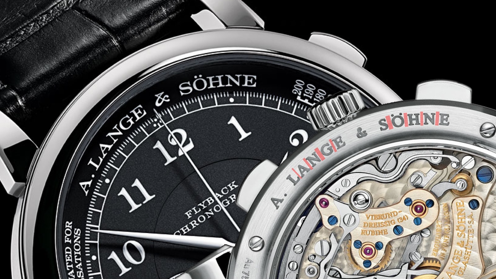
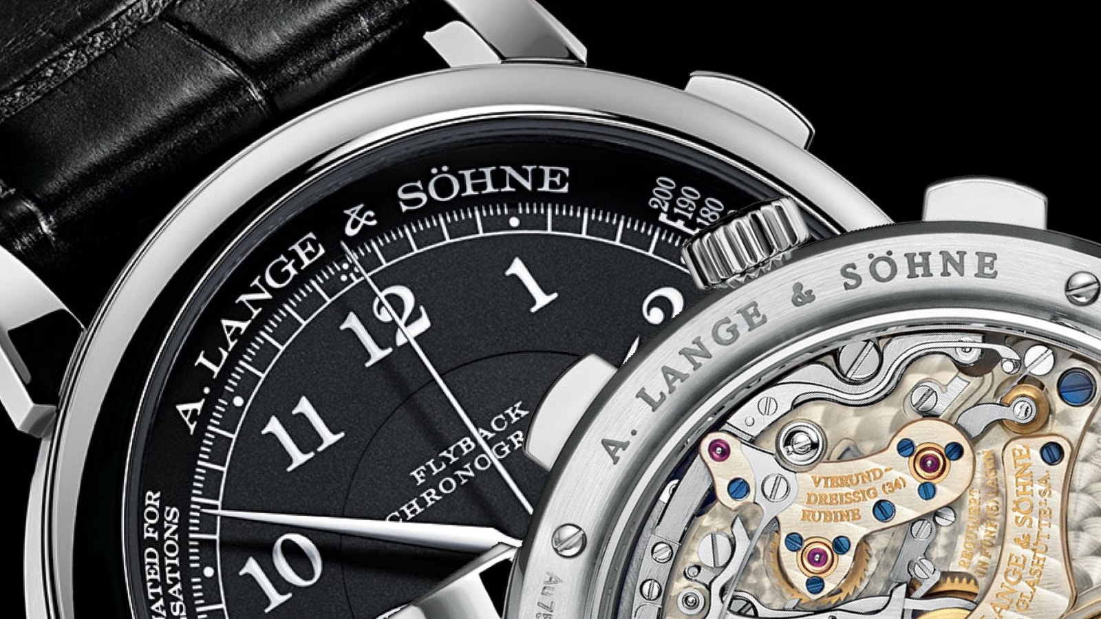
A. Lange & Söhne 1815 Chronograph
Swipe left and right to see kerning issues. I don’t know what happened here with the kerning of the “A. Lange & Söhne” engraving on the caseback. The character spacing is rather arbitrary, on the dial it’s balanced. It reads more like A. LAN GE & S Ö HN E (Source)
No boring dials please!
I’m not advocating for each watch to look like a Junghans Max Bill. I do see the point that some typefaces just went with the brand across multiple decades. That’s tradition and I think that is worth keeping alive since it’s also something that defines a brand. Some watches that others find ugly I really like, even if the typeface, layout or case shape is out of line. It’s what makes our hobby so fun. But then at least make sure that you don’t manually distort your Arial or at least get your kerning right. Not everbody can put their finger on bad typography, but everbody will feel that something is off. Watch typography matters.
Good article! For me typography on watch dial is as important as any other aspect. Not less important than overall proportions, colors, case profile, use of different planes etc. And for some reason they ruin their watches, by making these rookie mistakes. Sometimes I have thought about getting some micro brands, but then when I get into typography I just lose interest. Guys, make it right!
Doug
18.05.2024
I just found your site because of the Serica review. This article is spot on. I can’t believe how much poor typology shows up on watches that are supposed to be all about the details.
David Liu
29.12.2021
Wow, thank you for ruining my father’s GMT- Master II for me! In all seriousness, this article made me feel a lot less alone in getting disproportionately annoyed by bad typography in expensive watches. Allow me to share some examples of watches that I really wanted to like but simply couldn’t because of font choices that just make no sense to me. First, the Longines Master Collection Chronograph Calendar L2.673.4.78.3 which has this beautiful calligraphy-style font for the hour numerals and outer minute track as well as some other places. But then mixed in with that is Arial for the outer portion of the 9 o’clock subdial as well as the date numerals. It looks awful. But then they have their L2.827.4.73.0 which has this beautiful sans serif font for its subdials so they obviously have fonts that are not Arial available to them. Another one is the Hamilton Intra-Matic Chronograph H38416711. It’s a beautifully vintage-styled panda dial automatic chronograph, but its tachymeter bezel very obviously uses Arial, which isn’t horrible on its own, but is when horribly vertically compressed like it is here. You can tell because the horizontal parts of the numbers are super thin and the vertical parts of the numbers are super thick. Why would they do this??? And don’t even get me started on the Patek Philippe Perpetual Calendar Chronograph…


Will 29.10.2025
I love how you review watches and the layout of your data is so pleasing. Keep it up
Kaspar 26.10.2025
Awesome article, many thanks! Glad I know how to spot the difference now at a glance.
Risto wa666ou 06.10.2024
Good article! For me typography on watch dial is as important as any other aspect. Not less important than overall proportions, colors, case profile, use of different planes etc. And for some reason they ruin their watches, by making these rookie mistakes. Sometimes I have thought about getting some micro brands, but then when I get into typography I just lose interest. Guys, make it right!
Doug 18.05.2024
I just found your site because of the Serica review. This article is spot on. I can’t believe how much poor typology shows up on watches that are supposed to be all about the details.
David Liu 29.12.2021
Wow, thank you for ruining my father’s GMT- Master II for me! In all seriousness, this article made me feel a lot less alone in getting disproportionately annoyed by bad typography in expensive watches. Allow me to share some examples of watches that I really wanted to like but simply couldn’t because of font choices that just make no sense to me. First, the Longines Master Collection Chronograph Calendar L2.673.4.78.3 which has this beautiful calligraphy-style font for the hour numerals and outer minute track as well as some other places. But then mixed in with that is Arial for the outer portion of the 9 o’clock subdial as well as the date numerals. It looks awful. But then they have their L2.827.4.73.0 which has this beautiful sans serif font for its subdials so they obviously have fonts that are not Arial available to them. Another one is the Hamilton Intra-Matic Chronograph H38416711. It’s a beautifully vintage-styled panda dial automatic chronograph, but its tachymeter bezel very obviously uses Arial, which isn’t horrible on its own, but is when horribly vertically compressed like it is here. You can tell because the horizontal parts of the numbers are super thin and the vertical parts of the numbers are super thick. Why would they do this??? And don’t even get me started on the Patek Philippe Perpetual Calendar Chronograph…